a3 Workplace
OVERVIEW
a3 Workplace Strategies is a workplace project management firm in California’s Bay Area. They have an impressive catalog of work spanning tech, life sciences, healthcare, manufacturing, law, and nonprofits. They help their clients create environments that support their work and reflect their culture and brand.
This project focused on simplification and modernization of their existing website. My focus was to improve the flow of the site and improve the user experience through powerful visuals and meaningful content.
ROLE
Lead Designer, User Experience
User Flow, User Research, Competitor Analysis, Interaction, Visual Design, Prototyping & Testing, Information Architecture, Hi-fidelity Prototype
November 2024 - April 2025
I was the lead designer on behalf of a3 Workplace Strategies, employed to implement my client’s vision of a more modern version of their existing website. I focused on maintaining a meaningful message while creating a more visually pleasing website.
Maintaining brand continuity and creating a direct user friendly flow were also defined goals for the redesign. I worked with the design firm responsible for creating the original site along with the client to drive the design process.
The Problem
USER FLOW
Upon initial evaluation of the existing site, I found that a3workplaceservices.com was word heavy and visually cluttered. The aim to drive clients to work examples and services offered was diluted by too many pages and the presence of unnecessary content. I created a site map to help visualize this issue.
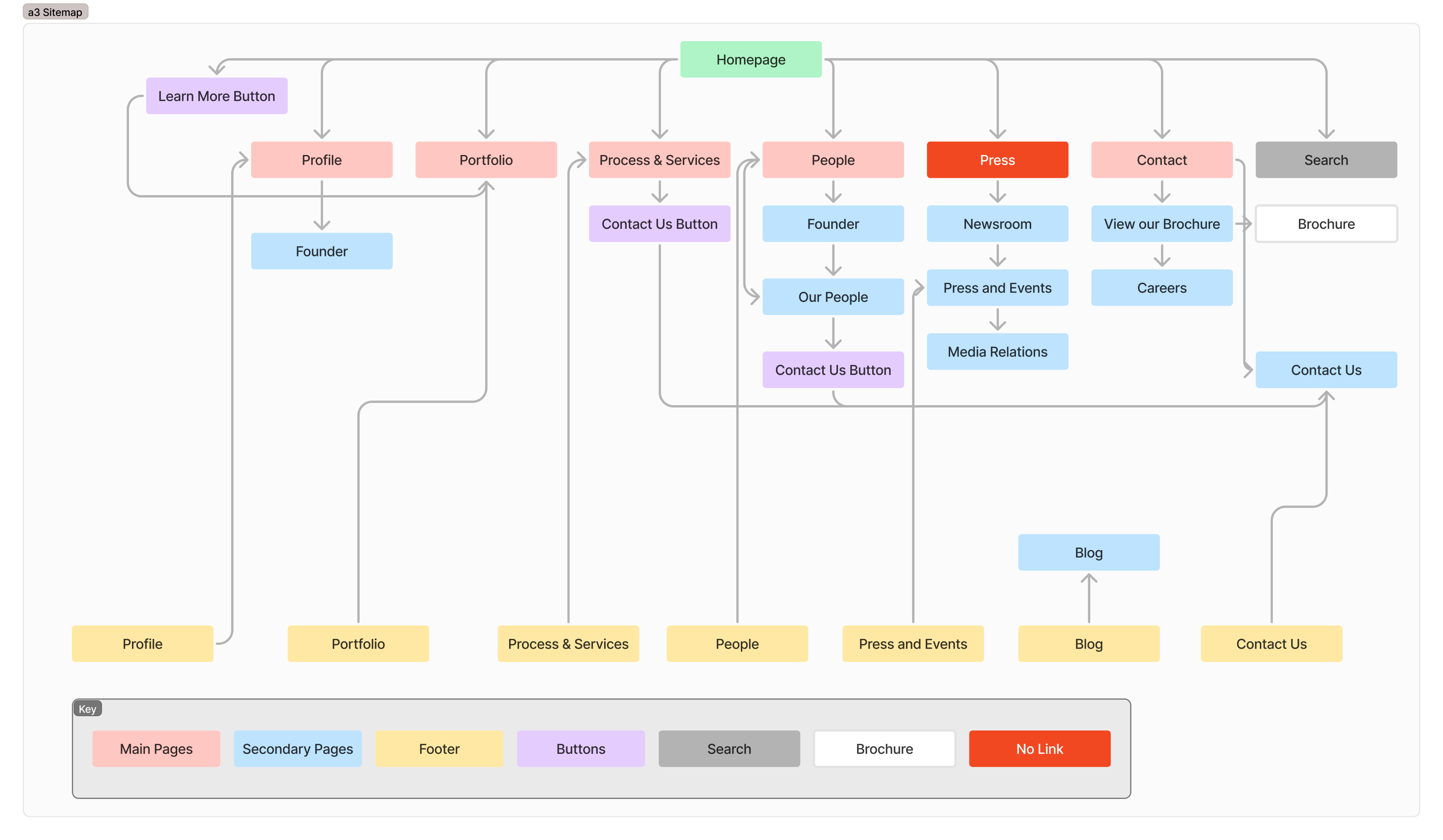
This sitemap led to a list of goals including...
- Updating navigation to improve flow and overall user experience. The nav bar was to minimize but remain at the top of the page so the user could easily reach all pages at any time.
- Consolidating pages to better group information. The “people” page would include the “founder” page as well as the “our people” section.
- Removal of content. All news and article based content would shift from the site to social media. The brochure would be removed completely and instead sent to clients on a case-by-case basis.
- Inclusion of CTA on every page. This would offer an option to contact a3 at many junctions.
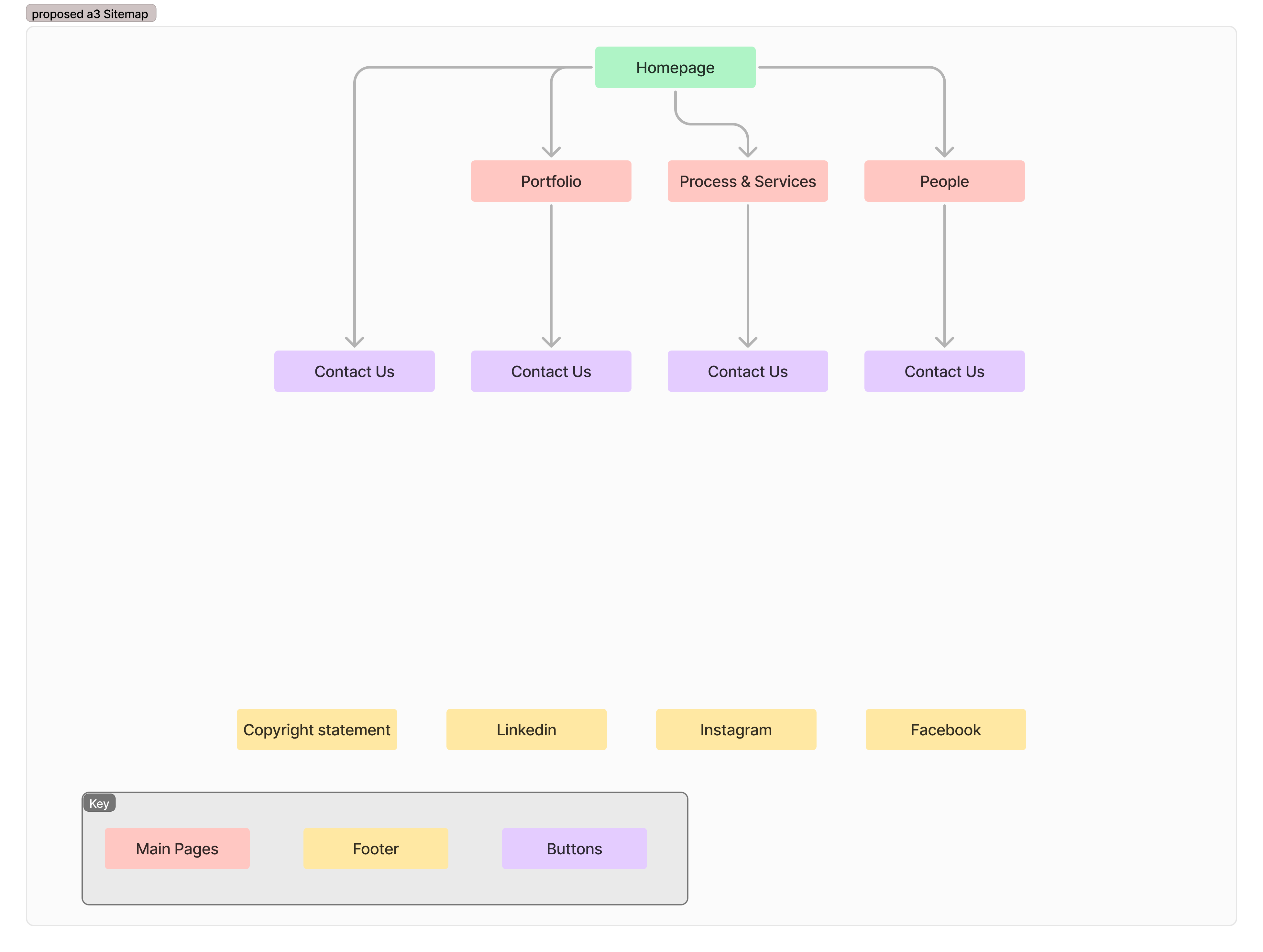
NEW SITEMAP
The proposed new sitemap demonstrated the simplification and focused direction of the redesigned website.
Design
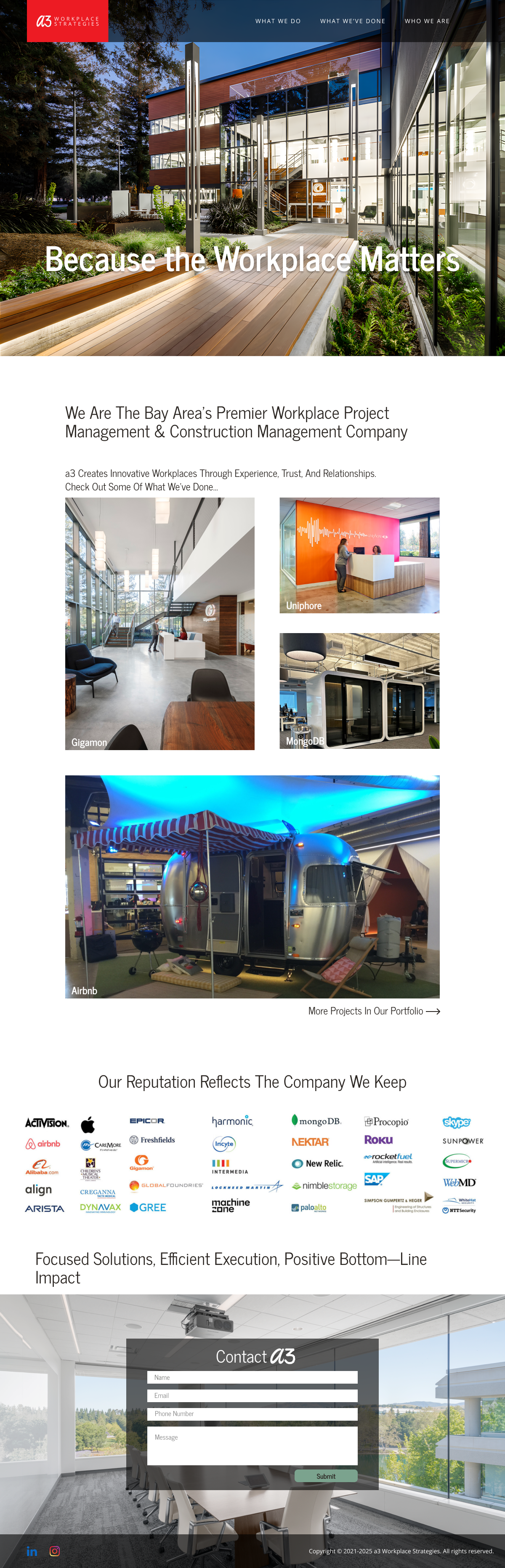
With the goal of modernization and simplification in mind, I set out to create elements that not only improved the experience for the user, but also lent a modern look for a3. These elements included a redesigned logo, the improved nav bar, and a CTA form to be included on every page.
REDESIgned logo
a3’s logo was to be redesigned to modernize and simplify the look. It was necessary to keep branding consistent so they could maintain familiarity with customers, and established clients.
The logo went through multiple iterations. Originally the client wanted to explore new colors.
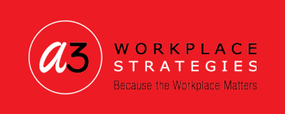
The old logo...
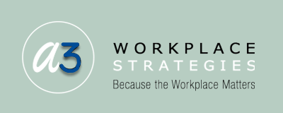
First iteration...
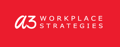
In the final iteration, in the interest of further simplifying the logo, I removed the company motto and the circle around the a3. I also suggested maintaining the red color in the interest of brand continuity.
The redesigned logo, final iteration...
Navigation bar
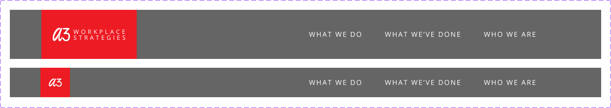
The nav bar was to minimize but remain at the top of the screen in order to improve the experience by providing easy access to all of the pages for the user to quickly browse.
The original nav bar had a number of links that provided too many options leading to a convoluted experience. Analytics showed that users were not visiting most of the pages leading to drop off.

The redesigned nav bar eliminated and consolidated the “profile”, and “people” links into one page called “WHO WE ARE”. The “portfolio” and “process & services” links remained, renamed “WHAT WE’VE DONE” and “WHAT WE DO”. The press information was moved to social media, and the “contact” link was replaced by a contact form at the bottom of each page. The search option was removed. The nav bar was to minimize but not disappear to provide easy access at any given time to the user.
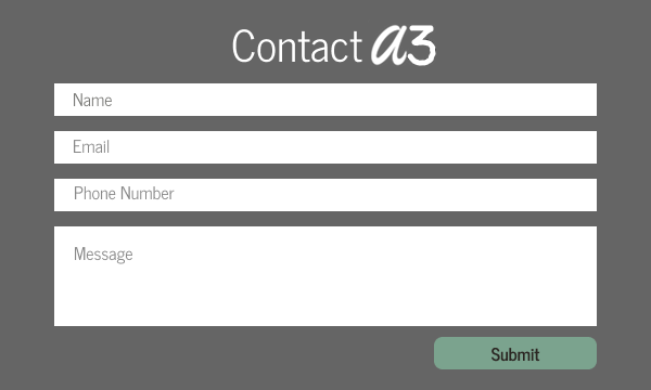
CALL TO ACTION - CONTACT FORM
It was a priority to include a CTA on each page in the form of the contact form. This would provide users multiple opportunities to get information, and engage a3.
Development
The development process involved 3 steps. The first step was to mockup a prototype and get approval of direction from a3 stakeholders. Step 2 was to receive feedback from the design firm that would implement the final coded site, and reiterate based on feedback. The final step was to complete hi-fi mockup and pass it along to coders, providing feedback on the site and approving iterations before taking the site live.
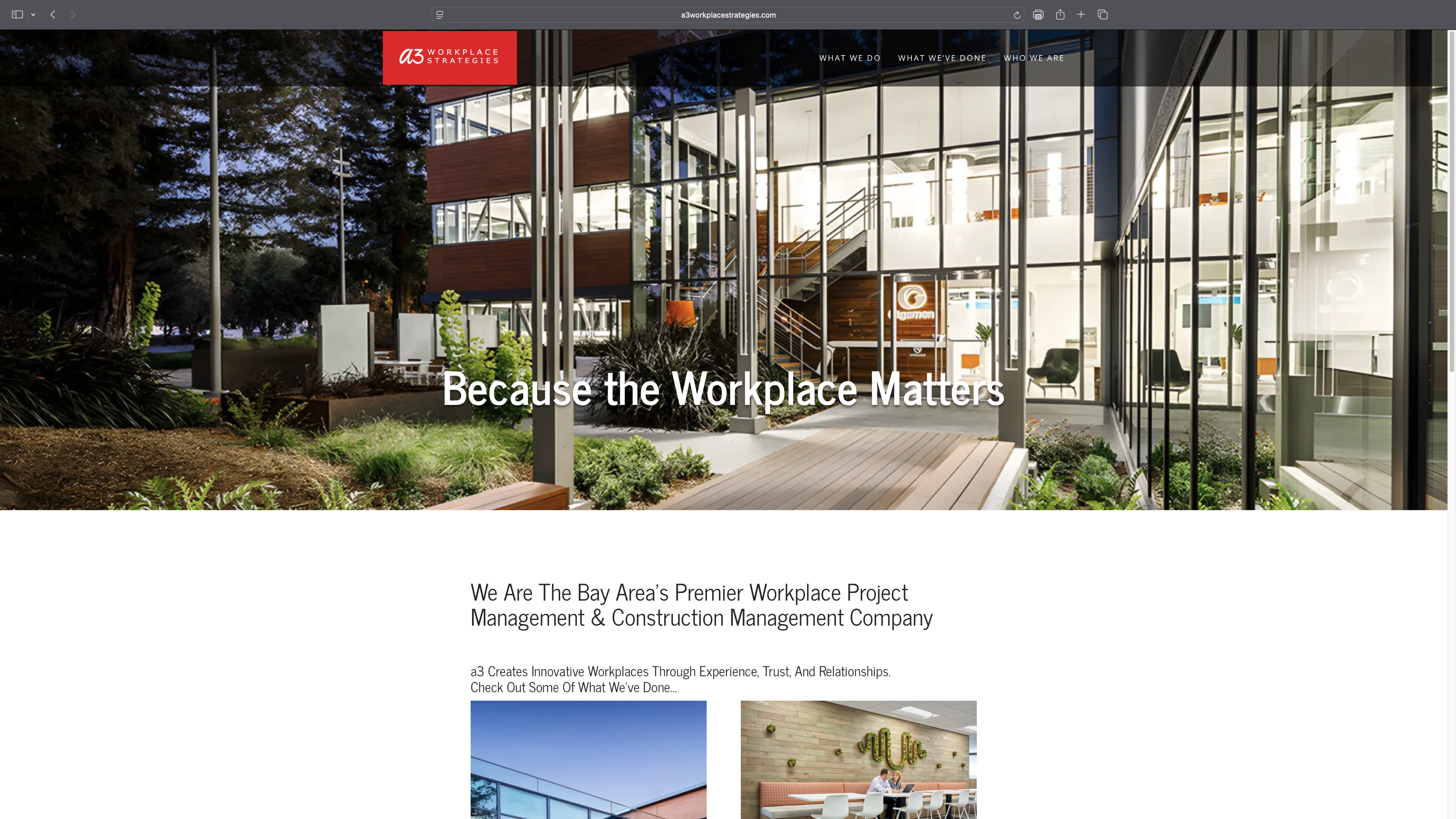
Homepage
The initial mockup involved creating the homepage for the stakeholders to review and approve of the direction.
Iteration
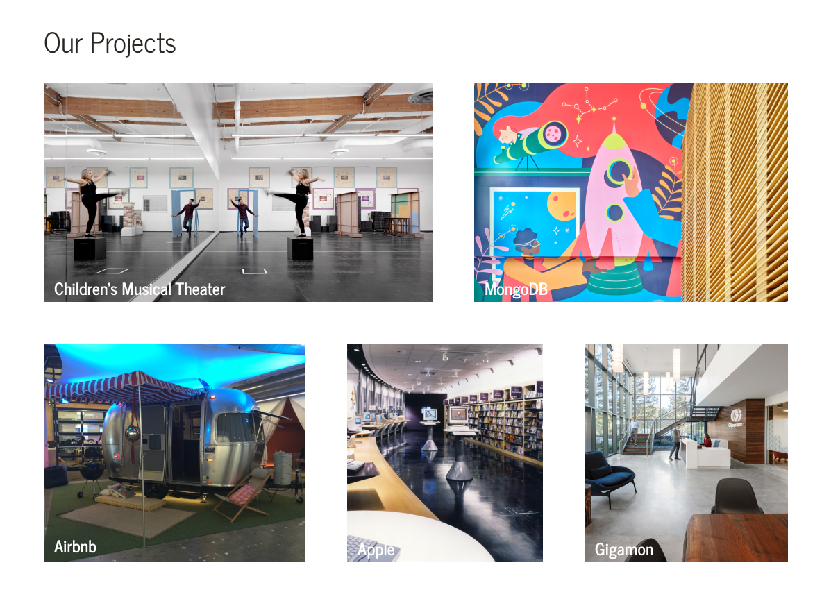
One standout iteration was to reorganize the project page so the images were spaced evenly and the wording was consistent.
It went from this...
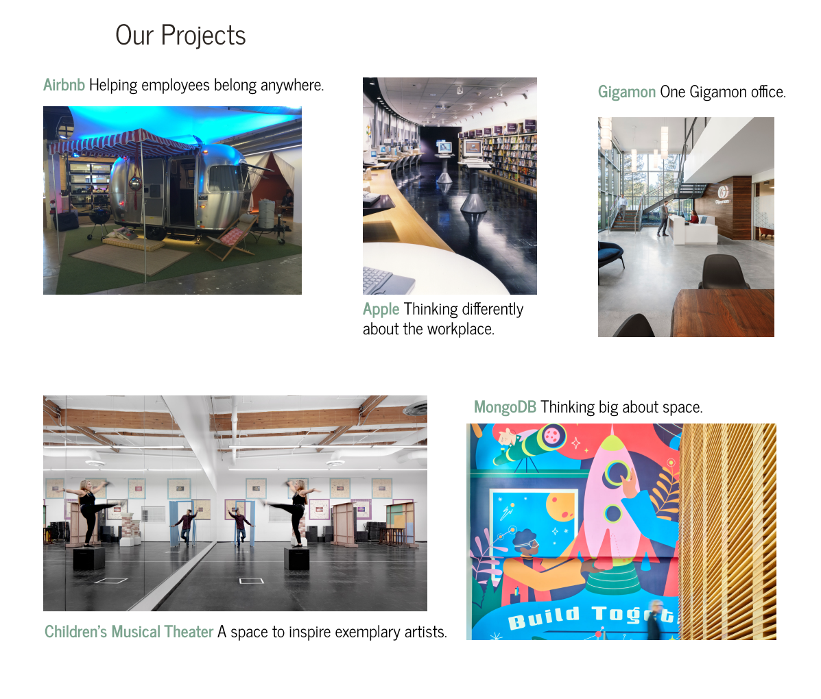
To this...
Click below to see the final version of the redesigned a3 Workplace Strategies site.
Results and Takeaways
This experience taught me how to balance being an advocate for the client and maintaining design principals. Serving as the go-between for the client and the design firm was an exercise in patience and emphasized the importance of articulating my design decisions.
Some of my takeaways from this project are:
- Simple and modern go hand in hand. A concise user experience helps keep the users engaged and prevents drop off. Simplify, go back and simplify, then simplify some more.
- Visuals are powerful. In the digital age, it is important to provide meaningful content and keep the user in mind. Pictures are worth a thousand words.
- Focus on the client goal. All suggestions and feedback do not need to be acted upon. Keep the client needs in the foreground.
Let’s connect
I am always open to opportunities and happy to help!


a3 Workplace
OVERVIEW
a3 Workplace Strategies is a workplace project management firm in California’s Bay Area. They have an impressive catalog of work spanning tech, life sciences, healthcare, manufacturing, law, and nonprofits. They help their clients create environments that support their work and reflect their culture and brand.
This project focused on simplification and modernization of their existing website. My focus was to improve the flow of the site and improve the user experience through powerful visuals and meaningful content.
ROLE
Lead Designer, User Experience
User Flow, User Research, Competitor Analysis, Interaction, Visual Design, Prototyping & Testing, Information Architecture, Hi-fidelity Prototype
November 2024 - April 2025
I was the lead designer on behalf of a3 Workplace Strategies, employed to implement my client’s vision of a more modern version of their existing website. I focused on maintaining a meaningful message while creating a more visually pleasing website.
Maintaining brand continuity and creating a direct user friendly flow were also defined goals for the redesign. I worked with the design firm responsible for creating the original site along with the client to drive the design process.
The Problem
USER FLOW
Upon initial evaluation of the existing site, I found that a3workplaceservices.com was word heavy and visually cluttered. The aim to drive clients to work examples and services offered was diluted by too many pages and the presence of unnecessary content. I created a site map to help visualize this issue.
This sitemap led to a list of goals including...
- Updating navigation to improve flow and overall user experience. The nav bar was to minimize but remain at the top of the page so the user could easily reach all pages at any time.
- Consolidating pages to better group information. The “people” page would include the “founder” page as well as the “our people” section.
- Removal of content. All news and article based content would shift from the site to social media. The brochure would be removed completely and instead sent to clients on a case-by-case basis.
- Inclusion of CTA on every page. This would offer an option to contact a3 at many junctions.
NEW SITEMAP
The proposed new sitemap demonstrated the simplification and focused direction of the redesigned website.
Design
With the goal of modernization and simplification in mind, I set out to create elements that not only improved the experience for the user, but also lent a modern look for a3. These elements included a redesigned logo, the improved nav bar, and a CTA form to be included on every page.
REDESIgned logo
a3’s logo was to be redesigned to modernize and simplify the look. It was necessary to keep branding consistent so they could maintain familiarity with customers, and established clients.
The logo went through multiple iterations. Originally the client wanted to explore new colors.
The old logo...
First iteration...
In the final iteration, in the interest of further simplifying the logo, I removed the company motto and the circle around the a3. I also suggested maintaining the red color in the interest of brand continuity.
The redesigned logo, final iteration...
Navigation bar
The nav bar was to minimize but remain at the top of the screen in order to improve the experience by providing easy access to all of the pages for the user to quickly browse.
The original nav bar had a number of links that provided too many options leading to a convoluted experience. Analytics showed that users were not visiting most of the pages leading to drop off.
The redesigned nav bar eliminated and consolidated the “profile”, and “people” links into one page called “WHO WE ARE”. The “portfolio” and “process & services” links remained, renamed “WHAT WE’VE DONE” and “WHAT WE DO”. The press information was moved to social media, and the “contact” link was replaced by a contact form at the bottom of each page. The search option was removed. The nav bar was to minimize but not disappear to provide easy access at any given time to the user.
CALL TO ACTION - CONTACT FORM
It was a priority to include a CTA on each page in the form of the contact form. This would provide users multiple opportunities to get information, and engage a3.
Development
The development process involved 3 steps. The first step was to mockup a prototype and get approval of direction from a3 stakeholders. Step 2 was to receive feedback from the design firm that would implement the final coded site, and reiterate based on feedback. The final step was to complete hi-fi mockup and pass it along to coders, providing feedback on the site and approving iterations before taking the site live.
Homepage
The initial mockup involved creating the homepage for the stakeholders to review and approve of the direction.
Iteration
One standout iteration was to reorganize the project page so the images were spaced evenly and the wording was consistent.
It went from this...
To this...
Click below to see the final version of the redesigned a3 Workplace Strategies site.
Results and Takeaways
This experience taught me how to balance being an advocate for the client and maintaining design principals. Serving as the go-between for the client and the design firm was an exercise in patience and emphasized the importance of articulating my design decisions.
Some of my takeaways from this project are:
- Simple and modern go hand in hand. A concise user experience helps keep the users engaged and prevents drop off. Simplify, go back and simplify, then simplify some more.
- Visuals are powerful. In the digital age, it is important to provide meaningful content and keep the user in mind. Pictures are worth a thousand words.
- Focus on the client goal. All suggestions and feedback do not need to be acted upon. Keep the client needs in the foreground.
Let’s connect
I am always open to opportunities and happy to help!

