NVG8
OVERVIEW
NVG8 is a consulting company based in San Jose, CA that specializes in helping companies launch and scale in the SalesForce ecosystem. I was brought in to help solidify branding and communicate their mission.
This project was important because of NVG8’s need to realize their identity through story and branding. My focus was to clarify and solidify branding as well as the story of the service they provided to clients.
ROLE
Freelance Designer, User Experience
User Flow, User Research, Competitor Analysis, Interaction, Visual Design, Prototyping & Testing, Information Architecture, Content Writer, Hi-fidelity Prototype, Webflow buildout
November 2023 - January 2024
NVG8 engaged me to perform a full redesign of their existing website. They wanted me to interpret what they do so anyone visiting their site could understand their specialty. I was to unify branding using their established brand colors and logo, as well as some infographics they had already created.
I prioritized brand and story telling using the existing website, the established branding, and leveraging conversations with the stakeholders. I took on the responsibility of all roles from design to website implementation, with a focus on content and continuity.
The Problem
IDENTITY CRISIS
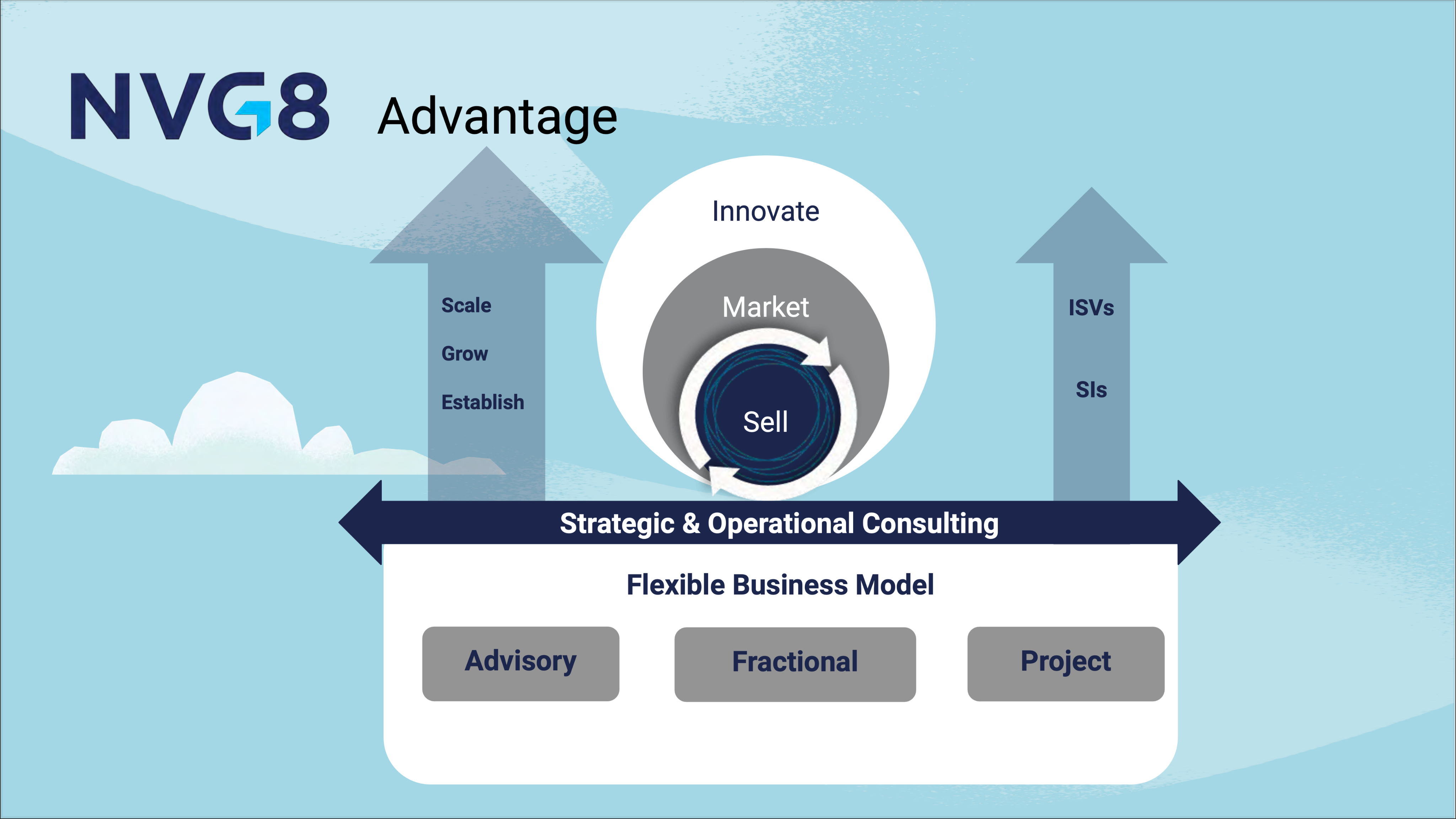
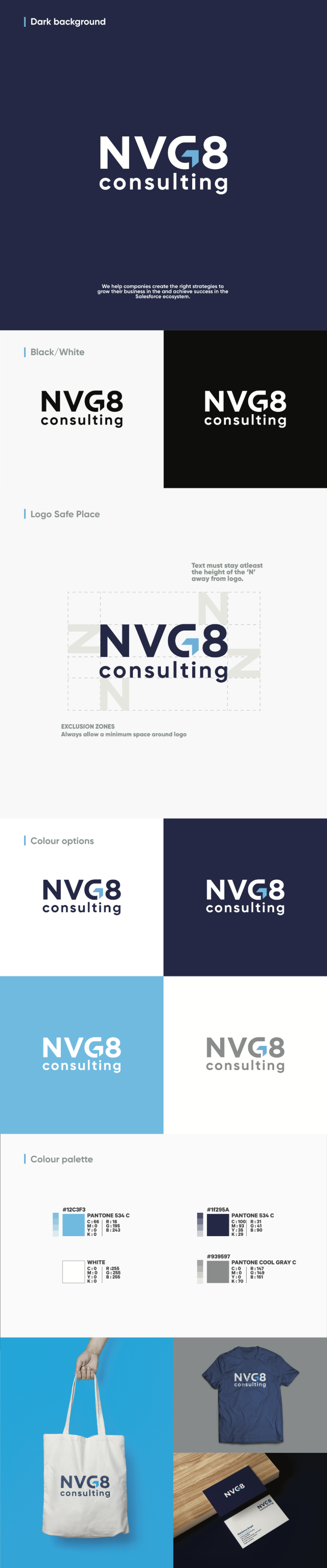
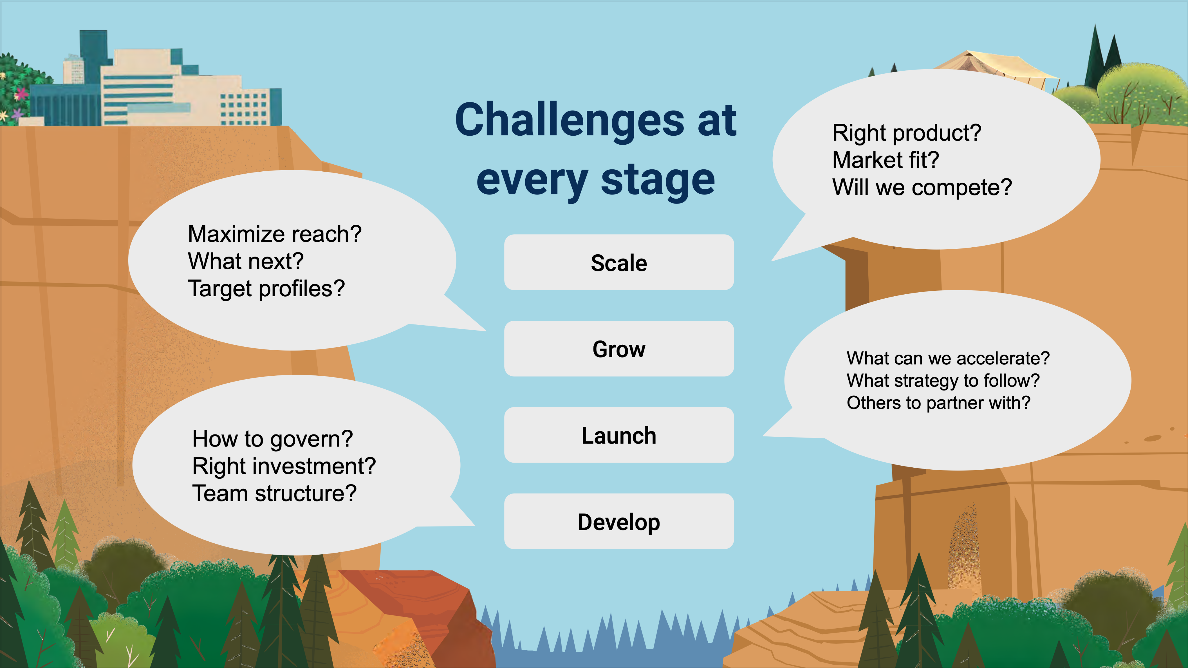
NVG8 was in dire need of an identity. What they do and who they are was not clear given their existing website. The lack of branding and clarity around their service was causing confusion for potential clients and ultimately costing them business. I was provided branding guidelines in the form of logo, color palette, and the below confusing infographic. I had to clarify services provided and translate that to simple direct messages for their new site.
Evaluation of provided materials and my takeaways from conversations with stakeholders gave me the following directives...
- Focus the story. Creating a focused narrative that clearly describes the services that NVG8 provides would help clients understand why they have a need.
- Solidify branding. By standardizing branding across their site NVG8 could develop brand recognition that could lead to more repeat business and build confidence in new clients.
- Improve user flow. By focusing on usability the new site would provide necessary information and a CTA to increase customer engagement.
FOCUSED STORY
Understanding what NVG8 does and interpreting it for the user was my first, and arguably my most important task. I referenced provided materials and the existing site during the information gathering phase of this process. Leveraging conversations with the clients I was able to clearly define their service and rewrite their story for all to easily understand.
MISSION STATEMENT
NVG8 did not have an official mission statement. I believe having one lends to a companies identity, and in the case of NVG8 I felt it would help tell the story what they do and build confidence in the brand. I created the following...
Our mission is to help companies grow their business, achieve accelerated results, and scale faster in the Salesforce ecosystem.
HERO
Using my new understanding I rewrote the hero section tag line so it was clear the services they provided.
The old tag line...
”We help technology companies partner better.”
The revised tag line...
“We help companies scale faster in the SalesForce ecosystem.”
Design
On the existing site there was zero evidence of branding. The black and white style gave a barren look to the site, and was not consistent with the provided logo and colors that were already established in the brand guidelines.
EXISTING SITE
PROVIDED BRAND GUIDELINES
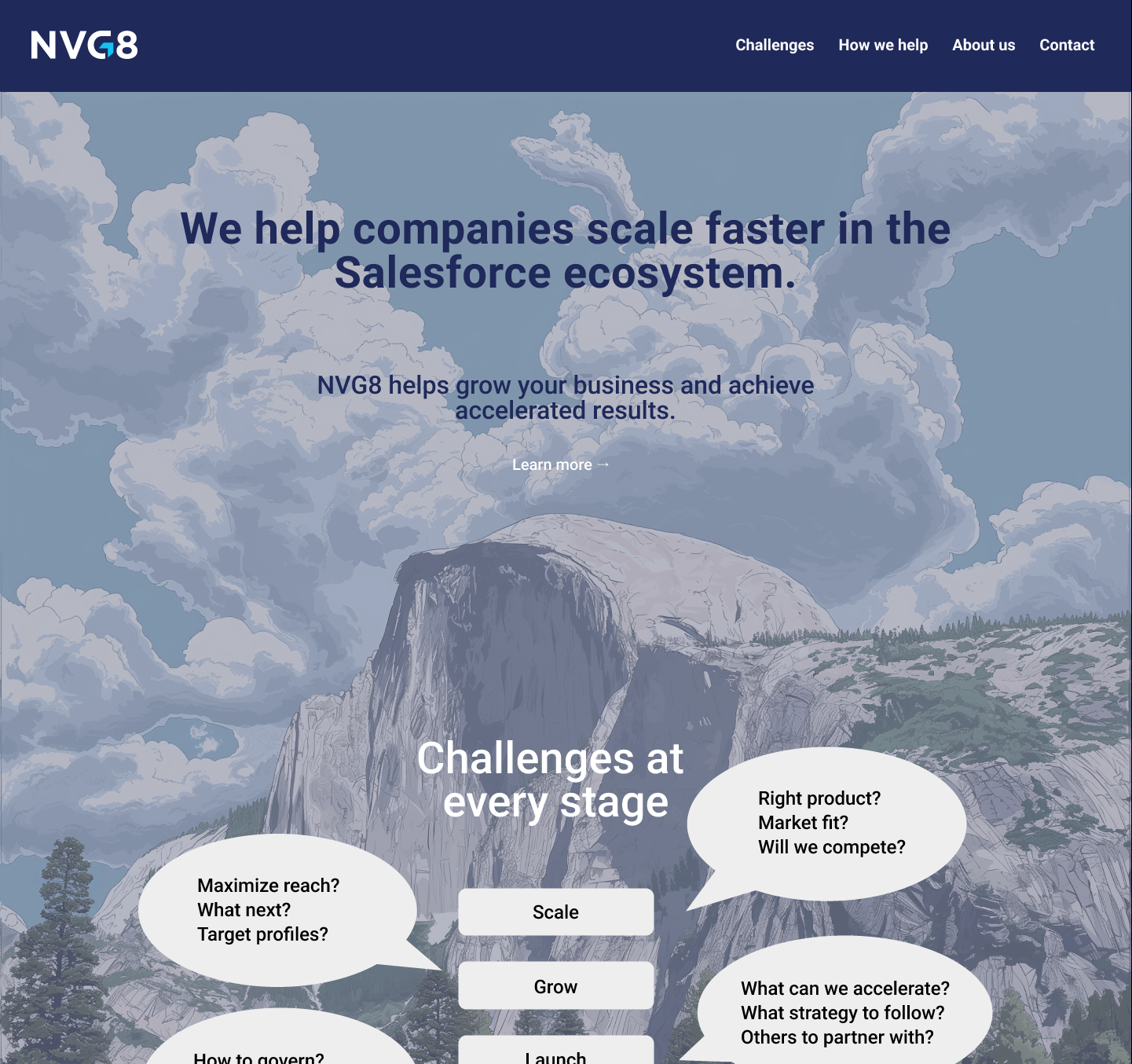
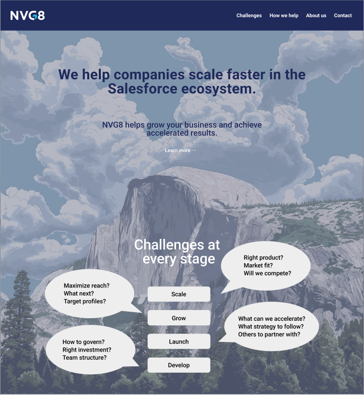
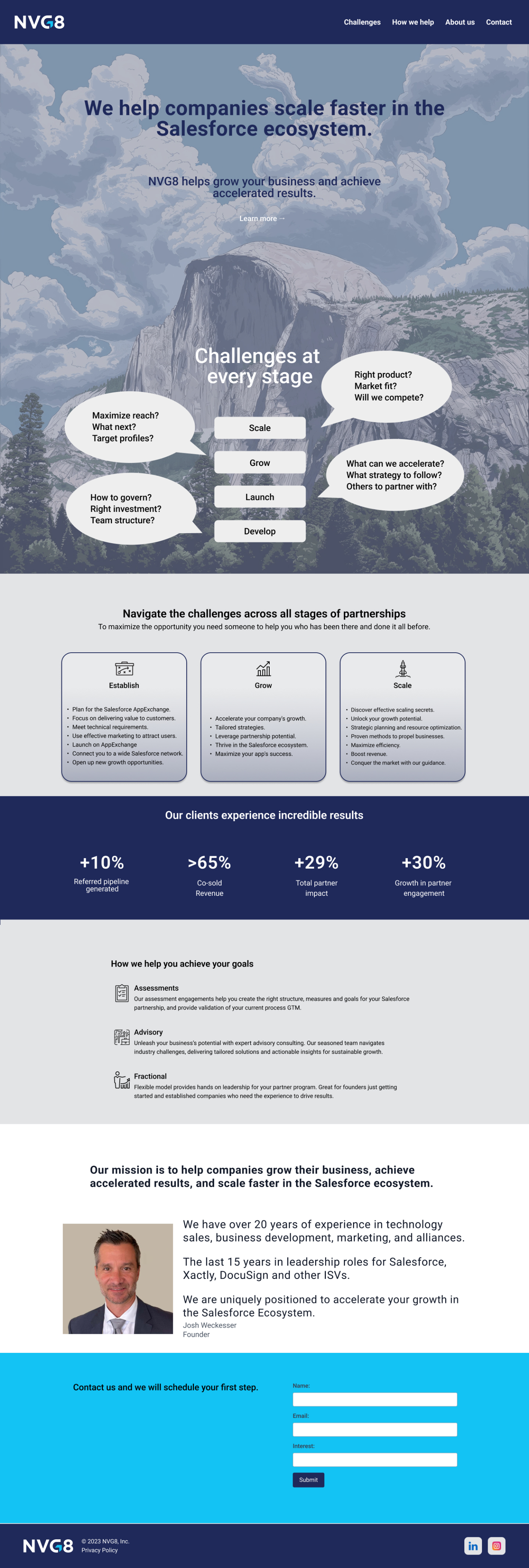
Above the fold it was important to have the established branding. The client expressed that they would like to include an image of Half Dome in Yosemite National Park. I used Midjourney to create a copyright-free image to use in the hero. I then layered the company color and added the brand color logo to the hero above the fold. I incorporated a provided infographic that helped define the service.
The provided infographic...
The redesigned hero...
Development
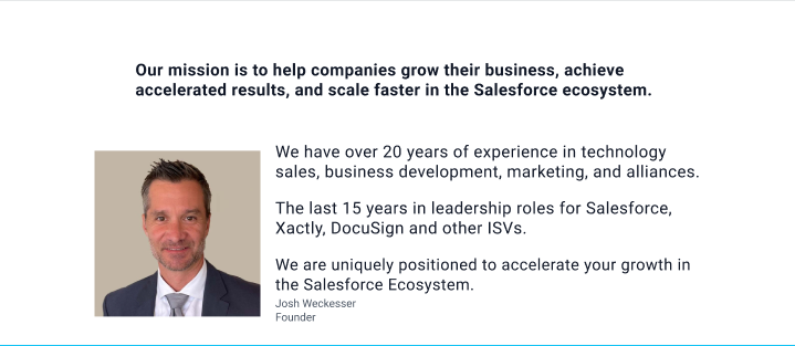
To implement the redesigned NVG8.com site I used Webflow referencing my mockup in Figma. To further solidify the brand I created a section that featured achievements of the founder. I used a provided headshot that personalized the story aiming to build trust in the brand. I added a CTA and included elements from the existing site to create my Hi-Fi mockup.
Founder section mockup...
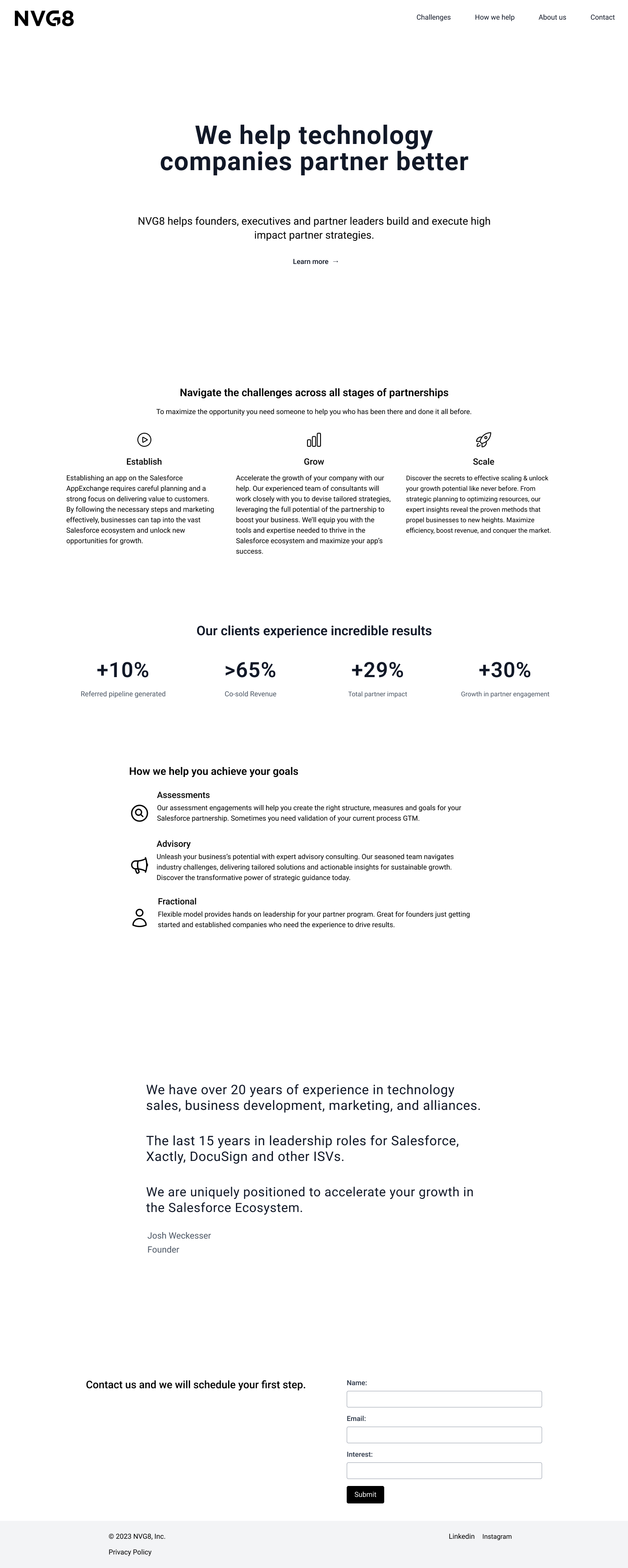
Final website...
NVG8 shifted their business direction and changed their name shortly after I completed this project. Please see the linked Figma file below for the final mockup.
Results and Takeaways
This project taught me that story is everything. A concise message is important for maintaining and building business. Brand consistency needs to be consistent across all platforms for recognicion
Some of my takeaways from this project are:
- Identity lies in the story. If a company cannot convey their service so it is easily understood, it will effect the bottom line.
- Brand consistency matters. A brand is important for success. Establishing branding and making it consistent helps to build and maintain a customer base.
- Do not get attached. It is good to be passionate about your work, but keep in mind the fact that it can change at a moment’s notice. Being flexible and not emotionally attached is important for a successful designer.
Let’s connect
I am always open to opportunities and happy to help!


NVG8
OVERVIEW
NVG8 is a consulting company based in San Jose, CA that specializes in helping companies launch and scale in the SalesForce ecosystem. I was brought in to help solidify branding and communicate their mission.
This project was important because of NVG8’s need to realize their identity through story and branding. My focus was to clarify and solidify branding as well as the story of the service they provided to clients.
ROLE
Freelance Designer, User Experience
User Flow, User Research, Competitor Analysis, Interaction, Visual Design, Prototyping & Testing, Information Architecture, Content Writer, Hi-fidelity Prototype, Webflow buildout
November 2023 - January 2024
NVG8 engaged me to perform a full redesign of their existing website. They wanted me to interpret what they do so anyone visiting their site could understand their specialty. I was to unify branding using their established brand colors and logo, as well as some infographics they had already created.
I prioritized brand and story telling using the existing website, the established branding, and leveraging conversations with the stakeholders. I took on the responsibility of all roles from design to website implementation, with a focus on content and continuity.
The Problem
IDENTITY CRISIS
NVG8 was in dire need of an identity. What they do and who they are was not clear given their existing website. The lack of branding and clarity around their service was causing confusion for potential clients and ultimately costing them business. I was provided branding guidelines in the form of logo, color palette, and the below confusing infographic. I had to clarify services provided and translate that to simple direct messages for their new site.
Evaluation of provided materials and my takeaways from conversations with stakeholders gave me the following directives...
- Focus the story. Creating a focused narrative that clearly describes the services that NVG8 provides would help clients understand why they have a need.
- Solidify branding. By standardizing branding across their site NVG8 could develop brand recognition that could lead to more repeat business and build confidence in new clients.
- Improve user flow. By focusing on usability the new site would provide necessary information and a CTA to increase customer engagement.
FOCUSED STORY
Understanding what NVG8 does and interpreting it for the user was my first, and arguably my most important task. I referenced provided materials and the existing site during the information gathering phase of this process. Leveraging conversations with the clients I was able to clearly define their service and rewrite their story for all to easily understand.
MISSION STATEMENT
NVG8 did not have an official mission statement. I believe having one lends to a companies identity, and in the case of NVG8 I felt it would help tell the story what they do and build confidence in the brand. I created the following...
Our mission is to help companies grow their business, achieve accelerated results, and scale faster in the Salesforce ecosystem.
HERO
Using my new understanding I rewrote the hero section tag line so it was clear the services they provided.
The old tag line...
”We help technology companies partner better.”
The revised tag line...
“We help companies scale faster in the SalesForce ecosystem.”
Design
On the existing site there was zero evidence of branding. The black and white style gave a barren look to the site, and was not consistent with the provided logo and colors that were already established in the brand guidelines.
EXISTING SITE
PROVIDED BRAND GUIDELINES
Above the fold it was important to have the established branding. The client expressed that they would like to include an image of Half Dome in Yosemite National Park. I used Midjourney to create a copyright-free image to use in the hero. I then layered the company color and added the brand color logo to the hero above the fold. I incorporated a provided infographic that helped define the service.
The provided infographic...
The redesigned hero...
Development
To implement the redesigned NVG8.com site I used Webflow referencing my mockup in Figma. To further solidify the brand I created a section that featured achievements of the founder. I used a provided headshot that personalized the story aiming to build trust in the brand. I added a CTA and included elements from the existing site to create my Hi-Fi mockup.
Founder section mockup...
Final website...
NVG8 shifted their business direction and changed their name shortly after I completed this project. Please see the linked Figma file below for the final mockup.
Results and Takeaways
This project taught me that story is everything. A concise message is important for maintaining and building business. Brand consistency needs to be consistent across all platforms for recognition. I also learned a valuable lesson that all designers will in their career in that a sudden shift can completely change your direction or halt your work all together.
Some of my takeaways from this project are:
- Identity lies in the story. If a company cannot convey their service so it is easily understood, it will effect the bottom line.
- Brand consistency matters. A brand is important for success. Establishing branding and making it consistent helps to build and maintain a customer base.
- Do not get attached. It is good to be passionate about your work, but keep in mind the fact that it can change at a moment’s notice. Being flexible and not emotionally attached is important for a successful designer.
Let’s connect
I am always open to opportunities and happy to help!

